Posts

Portfolio

Image
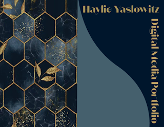
After experimenting a few adobe softwares over the course of this year, all my projects were put together into one portfolio. This was done on InDesign and I had a fun time creating it. I wanted a nice dark and elegant theme, which is why I went with navy and gold. I really enjoyed putting this together and looking back on my progress throughout the semester. I really like how this came out and I can definitely say that I enjoyed this class and I feel my skills through digital arts has progressed. This took about 4 hours.

Business Cards

Image
  For this project, I used different layers, fonts, and images to create a prototype business card using my logo. I decided to make a visitaustralia business card since I think it fits very well and it is a place I really want to visit. I used different color backgrounds to compliment the color of each logo. My personal favorite is the blue, red, and white one because I included the colors if the Australian flag and it looks really nice with the color logo. I am very proud with how this turned out. These took about 3-4 hours to create.

InDesign Tutorials

 https://www.youtube.com/watch?v=RXRT3dHu6_o In this 2 hour long video, he talked about the different main tools that are used and how to add shapes and layers. He gave a few tips on how to make images not look so pixelated and how to properly adjust the canvas and image sizes.  https://www.youtube.com/watch?v=0eqhUFRlvgI This video was much more convenient and he explained a lot of information in 9 minutes. He explained how its very similar to any adobe product we used. The page menu is going to come in handy when creating multiple designs and also have copies. https://www.youtube.com/watch?v=mVW8AF2TMnw In this 13 minute long video, he explained to importance and how much of the text box we are going to use. He mostly went over how to adjust the text and change size color and font all in the same text box, which is important when designing cards.

Autoscopy

Image
For this project, I wanted to contrast the background with what is going on inside me. The background is a peaceful environment that represents optimism and happiness that I want to surround myself with. Inside of me are flames and cogwheels to represent the amount of stress I have gained this year and how much I have changed negatively. I wanted to tell a little story and add a little seriousness to this project, but I like the contrast. I used layers and masking and curves to blend all the images together and adjusted the opacity, hue and saturation, and brightness to add more emphasis and darkness overall. I enjoyed using photoshop, it wasn't as hard as I thought. All Images Used  

Black and White to Color

Image
For this project, we had to turn a black and white image into color using the adobe color palette. I used colors that don't look natural but look good together. My favorite is the Split Complementary because there are three different colors used that contrast each other and the environment reminds me of The Little Mermaid. I used complimentary with blue and orange colors because I like the mix of warm and cool colors. I liked using monochromatic because it's different shades of the same color and looks a little natural.  I used this picture because I felt the background was perfect to work with and I wanted the rocks to be the focal point. It was hard selecting the right amount of area for each color change so I had to do multiple selections most of the time. I like that it doesn't;t look realistic but I like the colors I used.

Photoshop

 https://www.youtube.com/watch?v=pFyOznL9UvA This 36 minute long video went over the basics of the interface and all of its features. He went over the effects panel which looks very simple yet adds so much to it. He also covered working with pictures and text and went over the essential tools. He focused a lot on the eraser tool but I am not allowed to use it. instead I'll use masking to use a similar effect. It has a lot of similar features to illustrator so I am excited to use photoshop. https://www.youtube.com/watch?v=IyR_uYsRdPs This video was over 3 hours long, I didn't watch the whole thing because it was unnecessary, but he went over the best ways to create amazing final products using images. He was very helpful, he went over every little detail starting with the tools while using them and creating examples. He explained more in depth about the resolution and detailing that can be used and also went over layers and adjustments. He also did more complicated examples whic

Tag Brush

Image
  For this project, I needed to create a tag brush design using my logo from illustrator. I used a color combination I think look good together which is green and blue. I liked the scratch and spray effect we used to create the design around the logo. I think cooler colors went better with this design. Black and White Logo Used